LECTURE REFLECTION
Growing up surrounded by multiple cultures, I have been exposed first hand to globalisation within each of those countries. I have always found it very interesting how specifics can be very similar or even the same in 2 completely polar opposite countries.
Overall, I thoroughly agree that globalisation is a good thing, as mixing together multiple cultures & ideas can only lead to even more great outcomes & development within the field of graphic design. Of course, just like with everything, there are pros & cons, & globalisation is often seen down upon for eradicating traditions & tearing apart culture. But as Simon Manchipp said, “it’s an unstoppable force, there’s not a lot we can do about it & it’s going to continue through the mark of technology & communication” so all we can do is try to move on with it & accept it.
Having the chance to be able to do graphics for bands & artist who live across the world from me is an incredible opportunity, & none of this would be possible without the globalisation the world is facing today.
It really got me thinking when Adrian Talbot mentioned the difference in that a musical artist just puts out a finished product to their audience, while a graphic designer needs to interact with the client post them providing the brief to be able to come up with the exact outcome wanted. This is a very interesting contrast,
My job as a graphic designer is to understand, see & convey what they want to be understood, seen & conveyed
WORKSHOP CHALLENGE / FINAL OUTCOME
D&AD Awards 2019 Winners
When going through the categories, these main ones caught my eye: branding, cinematography, music videos, photography & product design. I looked through them without finding anything that caught my eye & so I decided to go through all the other categories one by one.
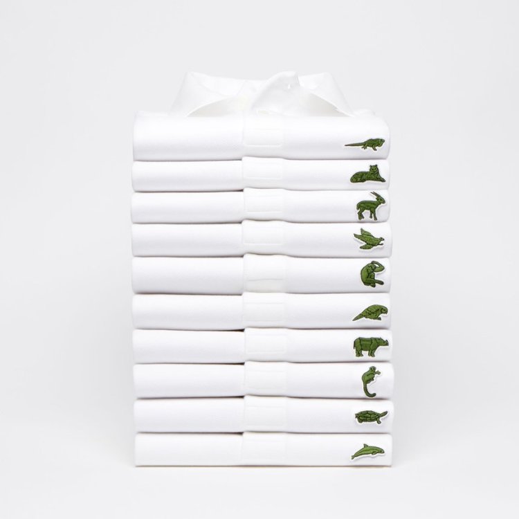
Lacoste: Save Our Species

The 1st that really caught my eye was the “Save Our Species” PR campaign Lacoste put out in collaboration with the IUCN. I believe the idea & impact is equally as important as the design & the fact that so much thought went into executing this whole campaign, from them “ditching” their official brand image to only releasing a certain amount of each shirt was in my opinion very a very well executed, timed, & calculated move, that spread awareness to a cause & not just a brand.
Apple: Behind The Mac

Following this week’s theme of globalisation, coming across Apple’s “Behind the Mac” video in the “Sound Design and Use of Music” category was very fitting. The casting of people of all ages, cultures, professions, all behind the same screen, really portrays globalisation @ it’s finest, & having so many people cast so many emotions, with a soothing song in the background all fit together in harmony very nicely. Myself being very passionate about videography, I aspire to create this kind of content myself: something people will be touched by.
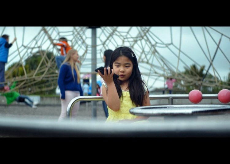
Spark: Generation Voice

The Generation Voice commercial in the “Film Advertising” category really inspired me as it focuses on today’s emerging technology (voice assistance) & focuses on how accessible information is nowadays. The cast being all children asking questions relating to things they are told by their parents & then getting a direct answer is a very powerful tool that the youth has @ the tip of their fingertips today. We often forget that we have almost every answer @ the tip of our fingers, which is in my opinion the most amazing thing ever. Once again this relates to the theme of globalisation, & reminds us all of how powerful it can be.
500 word synopsis
I have always been captivated by those pieces of design that choose to keep up with the world which is constantly evolving around us. This means I have never been a big fan of designs that only use for example 80’s styles, or use an element that has been overused but do not add their own twist to it. I have found that a lot of the award winners did fit in that category, and so only a few pieces did in fact actually stand out to me due to their nature of being unique, or building onto something that had been done in the past, rather than just copying it and calling it quits. All 3 main pieces of design I connected with all shared one common similarity, which was an important eye opening message, mixed with innovative design ideas, to create a unique piece of work. Each was structured in their own way to engage with their audience and have them emotionally connect with the piece of design, and this was done with various tools such as the use of music, images, a message, or a combination of all three. At the end of the day, having a solid structure behind what was created in terms of classic graphics tools such as use of colour, angles, textures, compositions, and so on, as well as a reason for the designer to create this design can only come up with positive outcomes, hence why I believe all those pieces won awards in the first place. They also all received very good responses from the general population including countless critics. The difference between all those pieces of work was the way in which they communicated their messages as well as how they designed the work. It feels to me every single aspect of those works had a purpose, nothing was made “just for the sake of it” and so every little thing used or created had a specific meaning to the overall finished project, which I believed is a very important part of creating any project. Why did they use this colour? Why this angle? Why was this created in the first place? Why this tone? Why this outcome? All those answers being answered gives a concrete understanding and evidence of why the project was created in the first place. The way each piece was marketed and tweaked to appeal to their target audience can really be reflected when seeing all the finished projects. Each makes individuals feel a certain way, & each can express different opinions in every single one of those individuals. At the end of the day, not everything created has to be explained in depth. I prefer when there is very little explanation and the meaning is left to the individual to make their own.
10 types of graphic design practice today
- Video game graphics
- Environmental graphics
- Web design
- Motion design
- Packaging design
- Illustration design
- Type design
- Brand design
- 3D design
- Publication design
Breaking the Boundaries

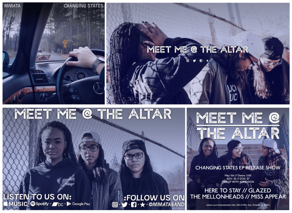
(branding I’ve developed for Meet Me @ The Altar’s EP titled ‘Changing States)
I have always had a great interest in branding, specifically artist branding. I have worked with artists in the past and helped them develop their brand through finding harmony with their logos, album artworks, and across their social media platforms. Branding has never been as competitive & crucial as today. The sole ideas of designing a brand & making sure everything links together in harmony goes way beyond developing supporting elements to a brand in the past.
Nowadays, branding around an album is as important as branding around the artist’ platforms, & goes all the way from the way they present themselves online to even what they wear. Being able to portray the way the artist wants their brand to be seen is much more meticulous than it would have been 20-30 years ago due to the access all their fans have to content & information. Under the branding of an artist we can nowadays include so many areas of graphic design (web design, advertising, typography, video production, & so on), & truly break the boundaries of classic branding., all of this work can be classified into a new term.
As seen above, the branding of an artist goes from the album artwork, to the header, to the Youtube outro layout, to the promotional flyers. I believe that artist branding could be its own category, as it goes way beyond a normal company’s brand development, & requires extensive work when it comes to introducing coherency across all artworks. This is called Coherency Development.
REFERENCES
Dandad. 2019. Behind The Mac | Apple |D&AD Awards 2019 Pencil Winner | Existing Music | D&AD. [online] Available at: <https://www.dandad.org/awards/professional/2019/sound-design-use-of-music/231141/behind-the-mac/> [Accessed 21 March 2020].
Dandad. 2019. Generation Voice | Spark New Zealand | D&AD Awards 2019 Shortlist | Cinema Commercials 41-60 Seconds | D&AD. [online] Available at: <https://www.dandad.org/awards/professional/2019/film-advertising/230897/generation-voice/> [Accessed 21 March 2020].
Dandad. 2019. Save Our Species | Lacoste | D&AD Awards 2019 Pencil Winner. [online] Available at: <https://www.dandad.org/awards/professional/2019/pr/230327/save-our-species/> [Accessed 21 March 2020].
Lin, D., 2016. Good Hair Day Pasta (Concept). [online] Packaging of the World – Creative Package Design Gallery. Available at: <https://www.packagingoftheworld.com/2016/03/good-hair-day-pasta-concept.html> [Accessed 21 March 2020].