LECTURE REFLECTION
The relationship between form & function: how we read, understand & engineer communication
“I was learning through touch, & I think that’s a very useful way of making: moving into a physical bodied approach to something.” – Sam Winston.
I really felt called out when Sam mentioned “when I did projects, it’s very useful not to be too concerned about the outcome. If you get carried away on this idea of security, such as I’m going to do a poster & I know I’m going to do it out of found debris & that’s what it’s going to be. If you enter that before entering the space, you collapse the space into just what you need from that space: a very mono view of the landscape.” It had me thinking about past projects & how I conducted them, Mentioned in my previous workshop, nothing having a concrete idea or direction for a project overwhelms me & leaves me staring at my screen without having any progress. So actually thinking about this on a deeper level is sort of new territory for me & definitely out of my comfort zone. I’m guilty of already thinking about my workshop outcome for this week, & I have not even done any research or finished watching the lecture/checking out the resources yet… I believe the reason this is, is because I mentioned how I really struggle with making sense of a lot of research all at once & being able to visualise what I’ve initially got.
“I think that’s how you should enter into the space initially: not knowing, & just listening.” – Sam Winston.
Steps to take towards a brief: 1) stand in a relevant environment of interest, 2) enter it, 3) what processes are relevant/useful/interesting 4) language used & language of reaction 5) design (all the previous elements tied together). How can I merge contrasting elements to make something unique, new & meaningful?
RESEARCH & REFLECTION
Arnold Schwartzman
What initially started my research for this week was Arnold Schwartzman’s 1984 Olympic poster, which was found in the resources section. I’m a huge fan of those designs that immediately strike a double meaning without it being forced into it. That means the double meaning being smoothly integrated within the design. Such an example of this approach is Arnold Schwartzman’s 1984 Olympics Poster, portraying track cyclists, with the Olympic ring portrayed by the overlap of the wheels.
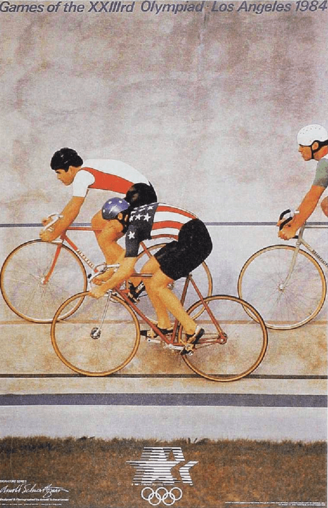
I really respect the perseverance & amount of tries it took for Schwartzman to finally get this shot. The coherence in the final design, the positioning, the colour scheme & most importantly the meaning, all fall together in perfect harmony, & create this amazing shot, which ended up becoming a very famous & representative poster.
Shigeo Fukada
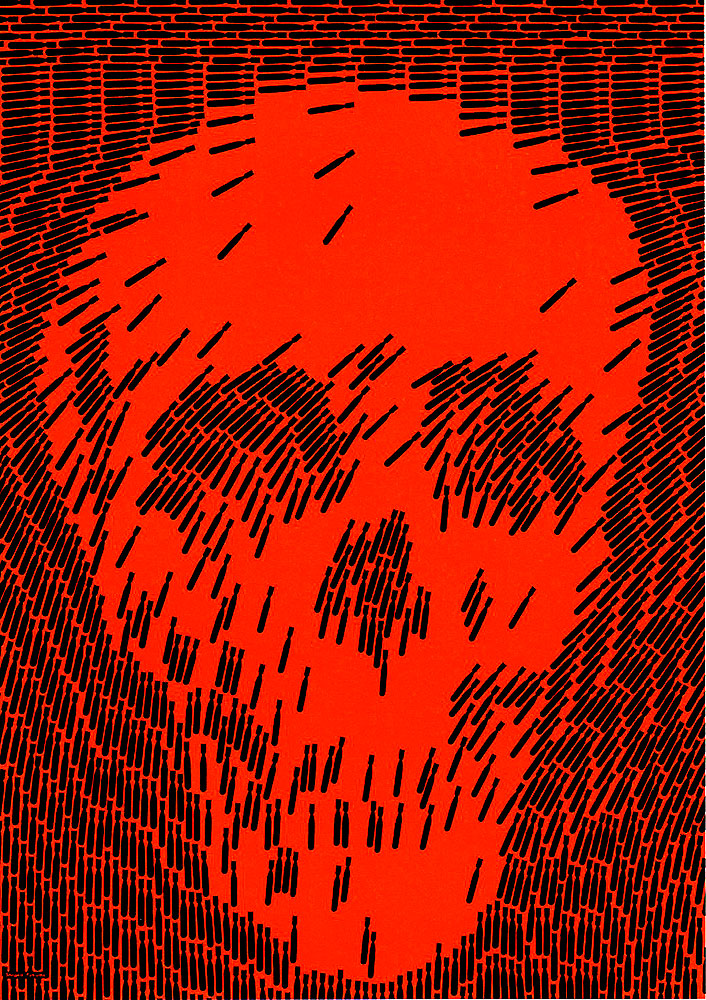
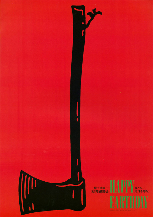
(Fukuda, 1968) (Fukuda, 1982)
I’ve always been very inspired by Shigeo Fukuda’s work. He was mainly known for being an illusionist, who often focused on the emotion of deception in his designs. A lot of his work includes a double meaning which usually needs a more interested second look to notice. “Anti-war Poster” shows the arrangement of hundreds of little nuke drawings into forming a skull, representing death, war, & the anger associated with such an immoral practice. “Happy Earth-day” portrays an upside down axe, which is ironically made from wood, with a tree attempting to grow at the extremely, portraying the juxtaposition between celebrating earth day yet continuing to chop down thousands of trees per day. I love his minimalism and symbolism, & I will definitely keep him in mind when coming up for this week’s final outcome.
Andi Bocsardi
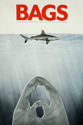
There are thousands if not millions of designs that have as a goal to illustrate the way humans are destroying the planet today. From polluting, to killing off species, to making the sea levels rise, a huge amount of artists have showed their perceptions of the situations. To me, a piece that really stands out, is “Bags” by Andi Bocsardi (which I have previously mentioned in Week 4 – The Self & Identity). His work, strongly inspired by the famous block buster movie poster “Jaws,” illustrates that the real danger is not sharks, but plastic. It conveys anger, frustration & sympathy. As someone who deeply loves the ocean, I can fully relate to the impact of this artwork, & it makes me want to be able to do something, yet being just 1 person is not going to fix anything.
REFERENCES
Bocsardi, A., 2019. Bags.
Famous Graphic Designers. 2018. Shigeo Fukuda | Biography, Designs And Facts. [online] Available at: <https://www.famousgraphicdesigners.org/shigeo-fukuda> [Accessed 21 March 2020].
Fukuda, S., 1968. Anti-War Poster. [Paper cut out, collage].
Fukuda, S., 1982. Happy Earth-day. [Marker on cardboard, collage].
McAlhone, B., Stuart, D., Quinton, G., Asbury, N. (2016) A Smile in the Mind; Witty Thinking in Graphic Design (Links to an external site.). London: Phaidon.
WORKSHOP CHALLENGE
“The environment is a very delicate & fragile thing at the moment, & that’s an incredibly rich place for rich thought. – Sam Winston.
All the work that really sparked an interest to me while doing my research was based on awareness. Whether it is awareness in political tensions, war crimes, or pollution, I highly connect with giving a project an impactful meaning.
My location: Boracay, Philippines
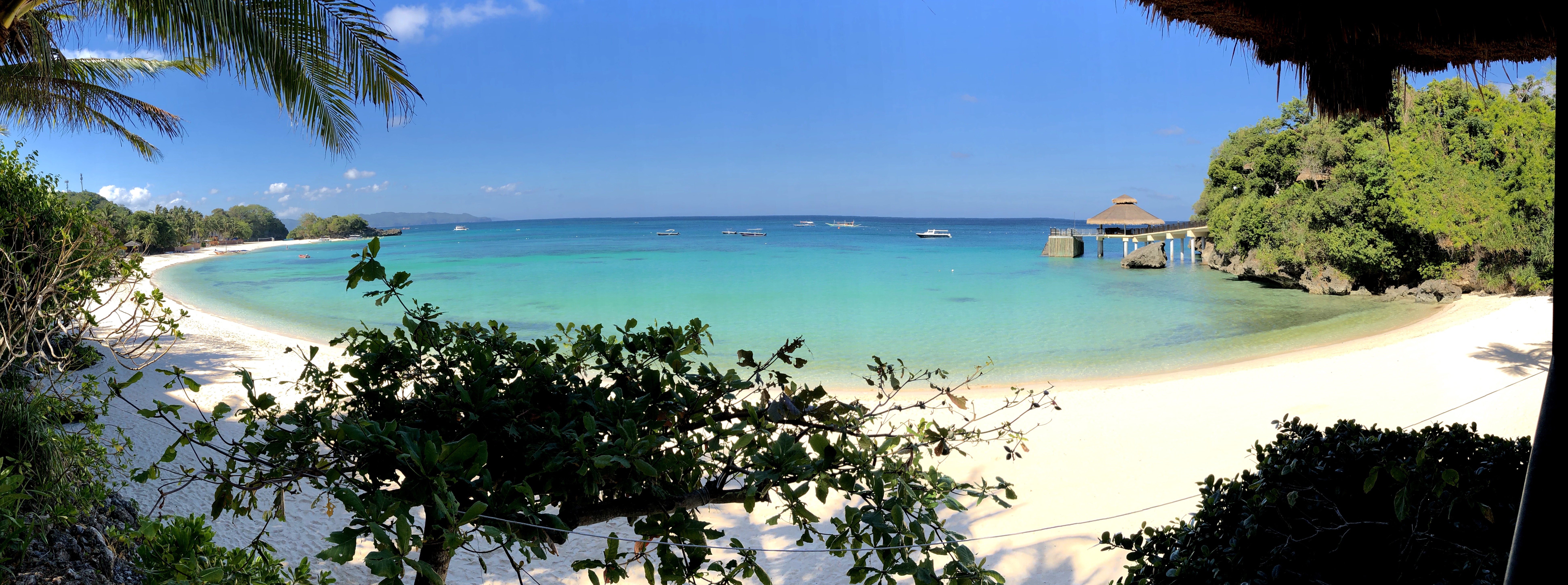
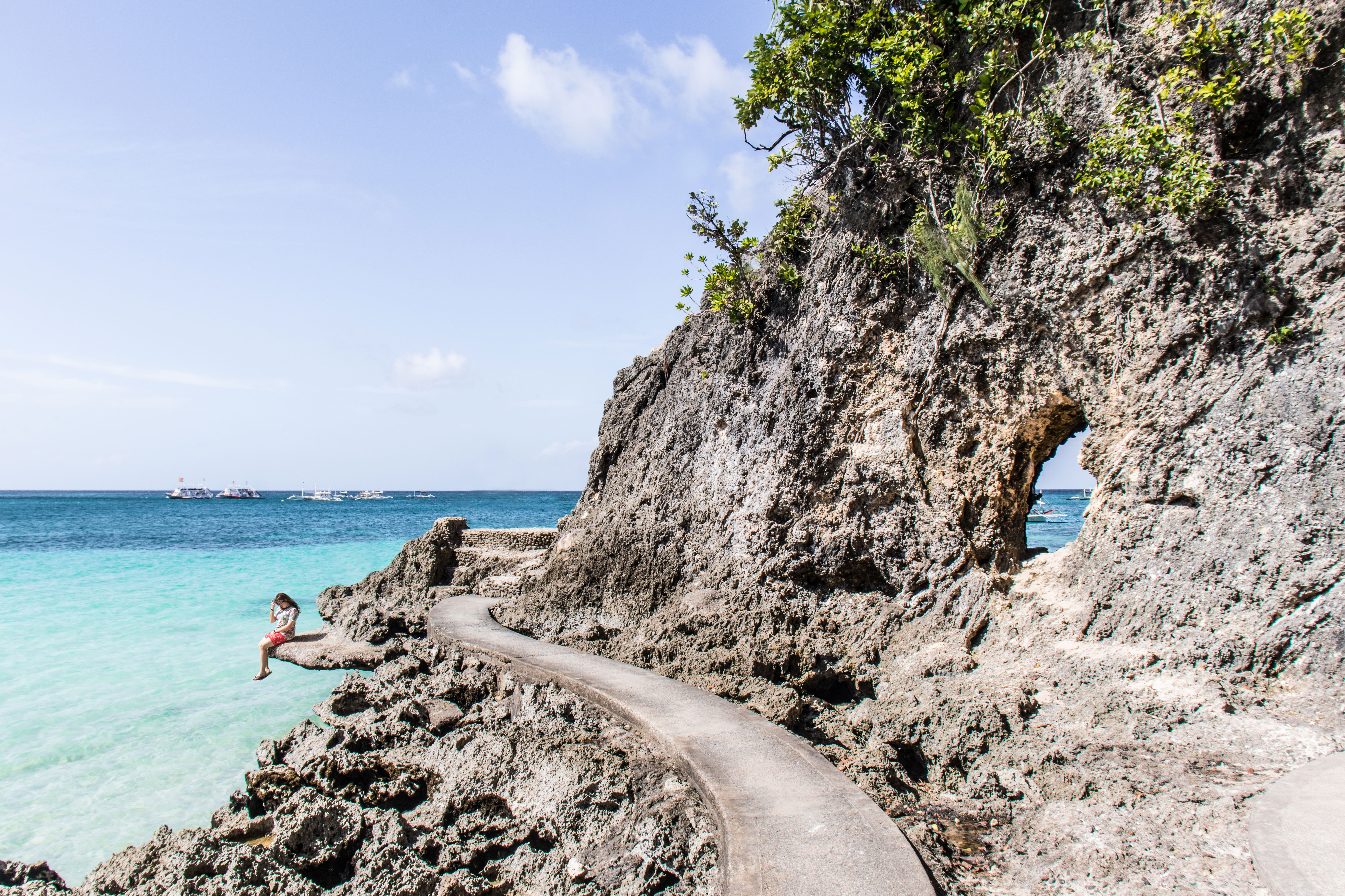
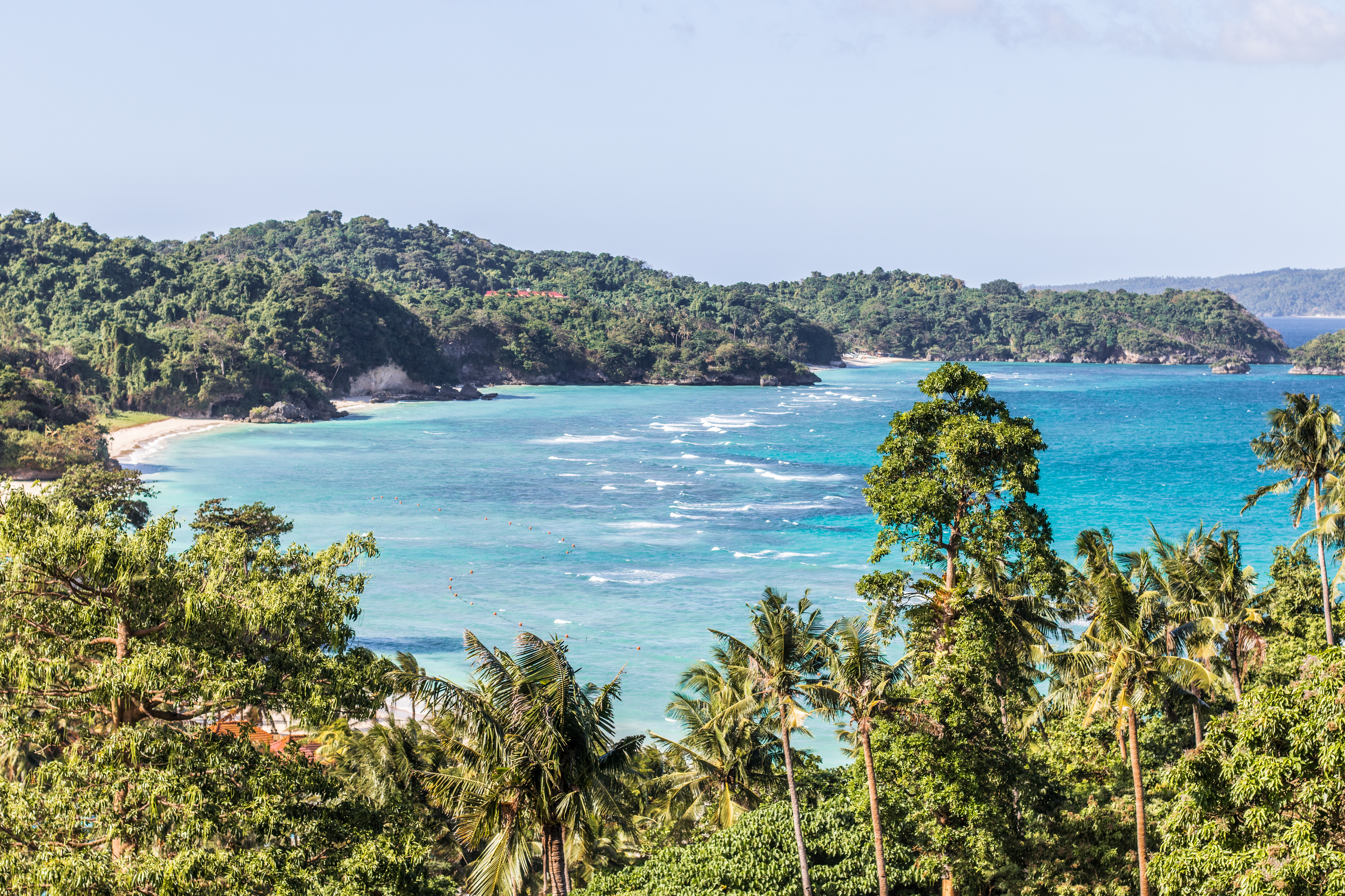
This is Boracay, covering a total area of 10.32 km², is located in central Philippines, & is mainly known for its beaches. & yes, there is not much else to do except going to the beach. Since the island is currently on lock down do to the COVID-19 outbreak, I am currently stuck on home quarantine, & am unable to leave my parents’ house. There are definitely worse places to be stuck on, that’s for sure. But yes, the sector I can currently roam is… very limited.
My emotion
I’ve dealt with working with emotions & their definitions in the past. in fact, one of my last projects for my undergraduate degree was on this very topic. I made a PDF titled “A Guide To Understanding Emotions Through Music For Individuals with ASPD” which I ended up getting a 1st on. Due to emotions being a broad and subjective subject, I followed a study by Alan S. Cowen and Dacher Keltner, which clearly highlighted 27 different emotions, the same study I had followed for my project.
From sitting outside every evening, all you can hear is the sound of insects, & chickens in the distance. It’s super peaceful here, so calm. But it gets deeper, I wanted to make something meaningful, that would give some sort of awareness. After thinking about multiple ideas, I remembered I had retrieved quite a bit of fishing nets on a dive I did a few days before being home quarantined. Ultimately, I decided to focus on the combination of anger, empathy & sadness: this is because I believe it is impossible to create something that only conveys 1 single emotion: all humans are different, & will feel different things.
My message
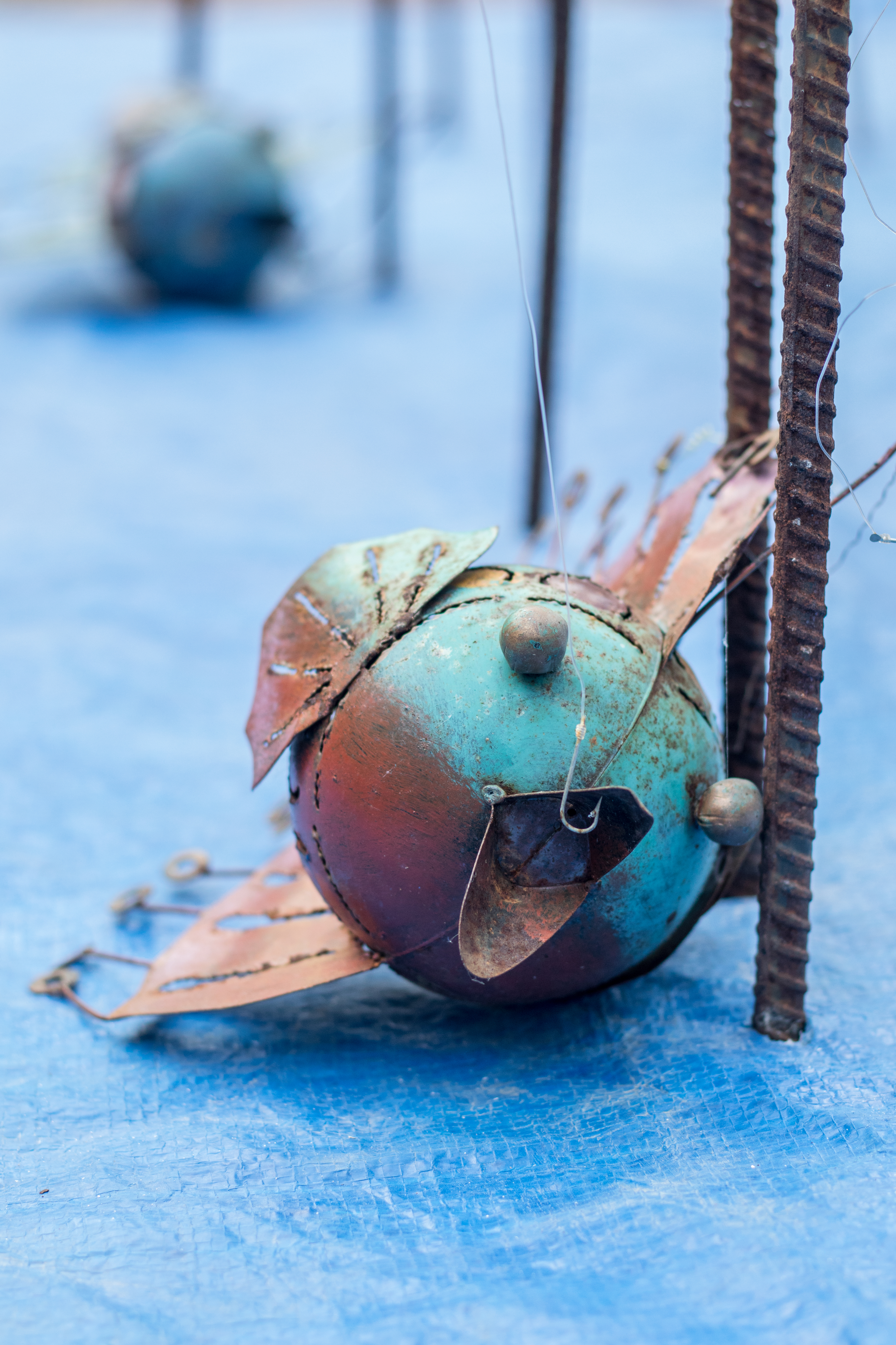
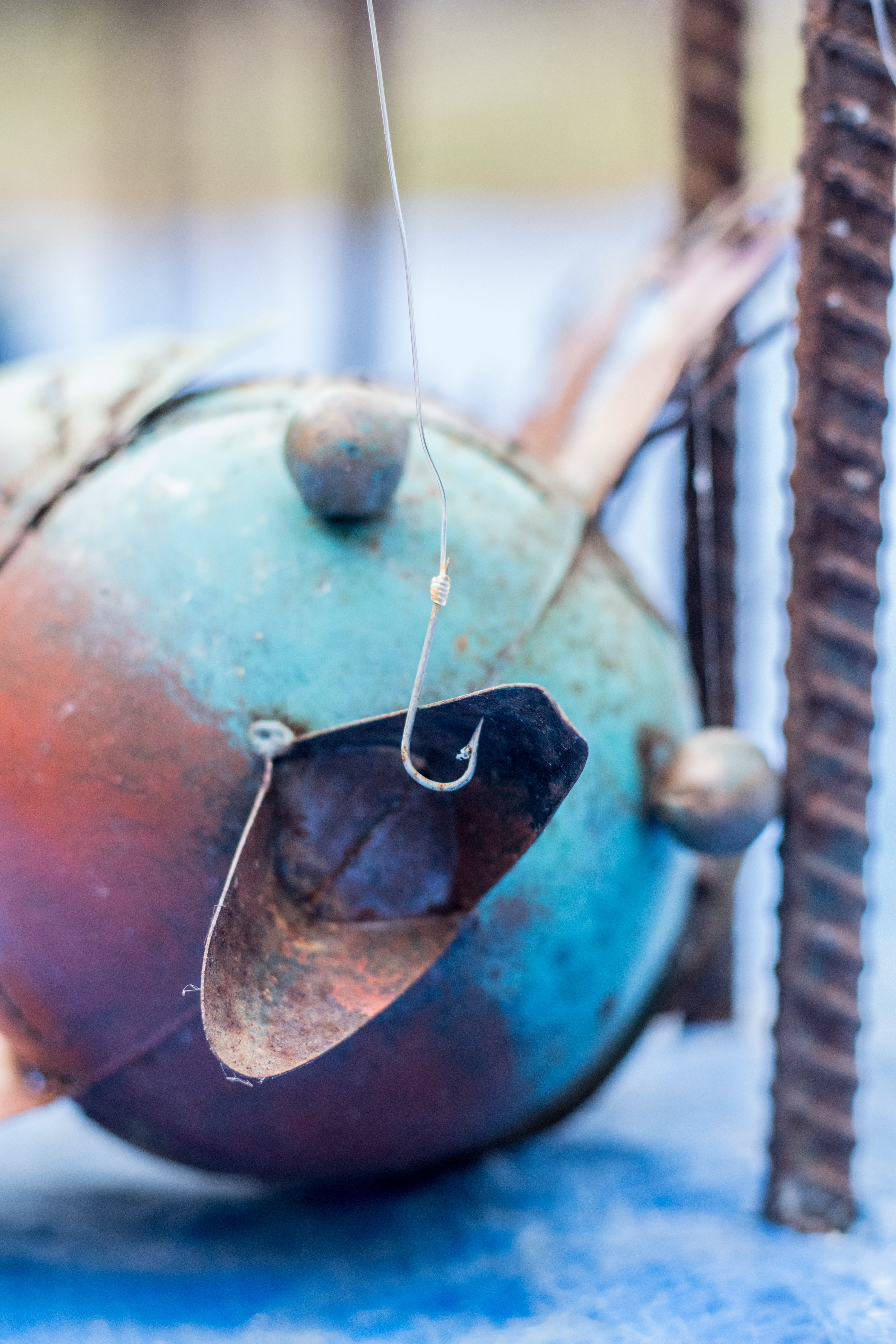
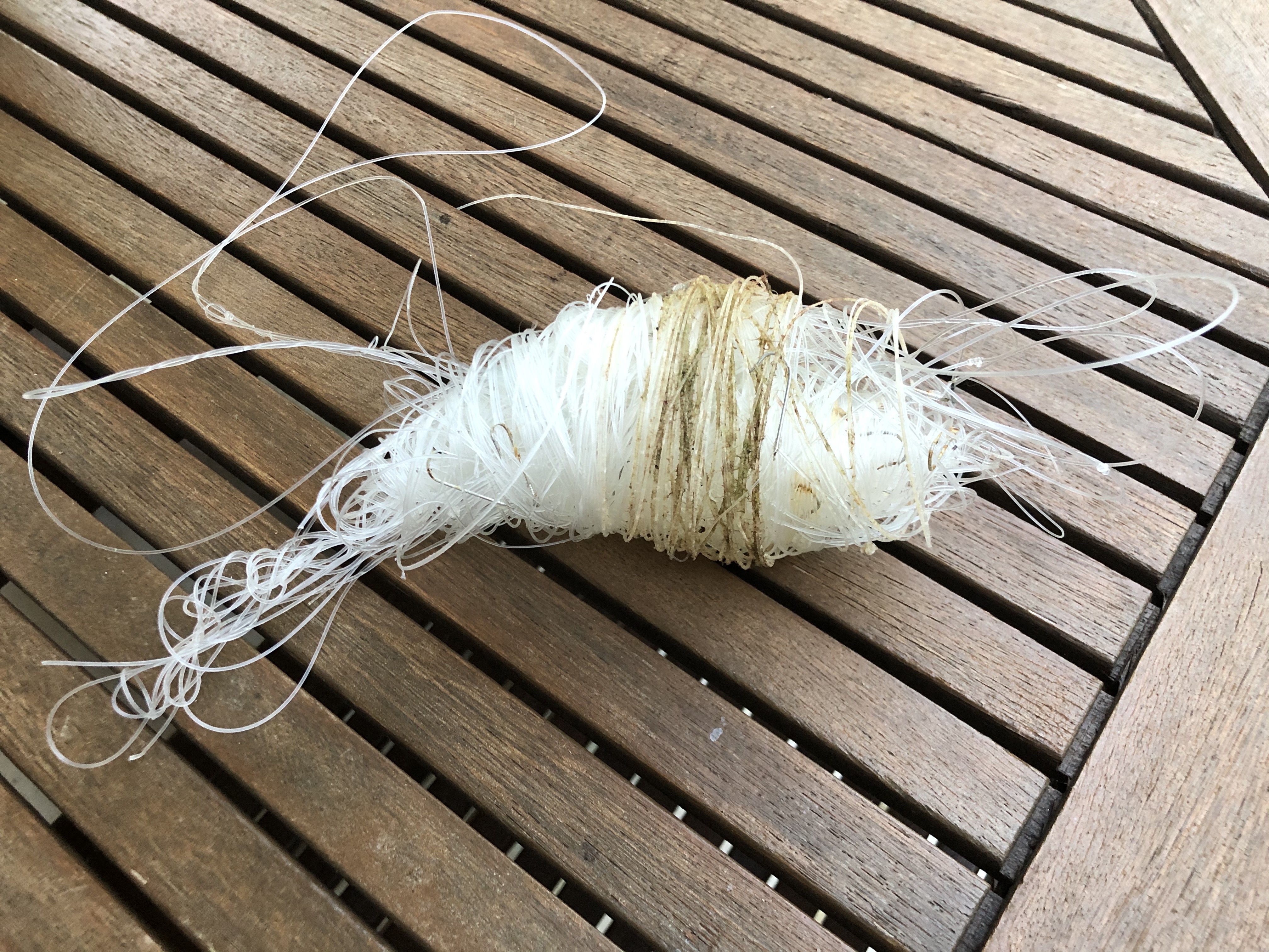
With the quarantine going on, there has also been a significant decrease in the number of police officers roaming in boats around the island. This means that a lot of locals have been seen fishing illegally over protected reefs, which are also reefs where divers tend to dive. I went to one of those reefs a couple days before the home quarantine, & the whole dive plan was scrapped when we came across metres of fishing nets. The hooks @ the end of them were stuck in corals, & there were some fish that had unfortunately bit into the hook & died trying to escape. We spent 50 minutes retrieving the nets, & removing the hooks from the corals & the mouthes of the dead fish. All of this had me very angry, & those nets are not only dangerous for the marine life, but also for divers.
I want this outcome to give an emotional reaction to the viewer. I will film it with my drone, & film it from the perspective of a bird. The bird will see the fishing nets bellow (which represent the illegal fishing, & the fact that the shape of a fish will be made with the nets, is a call out to them that they are doing something illegal), which will read the word “flee” made from the nets into the shape of the bird. The bird being unable to do anything about the situation, will simply follow the message & flee away from the scene, fleeing away from human activity, to protect itself. This will also convey how we are currently on lockdown, while the birds have no limits to where they can go & what they can do: they are free, yet are unable to help.
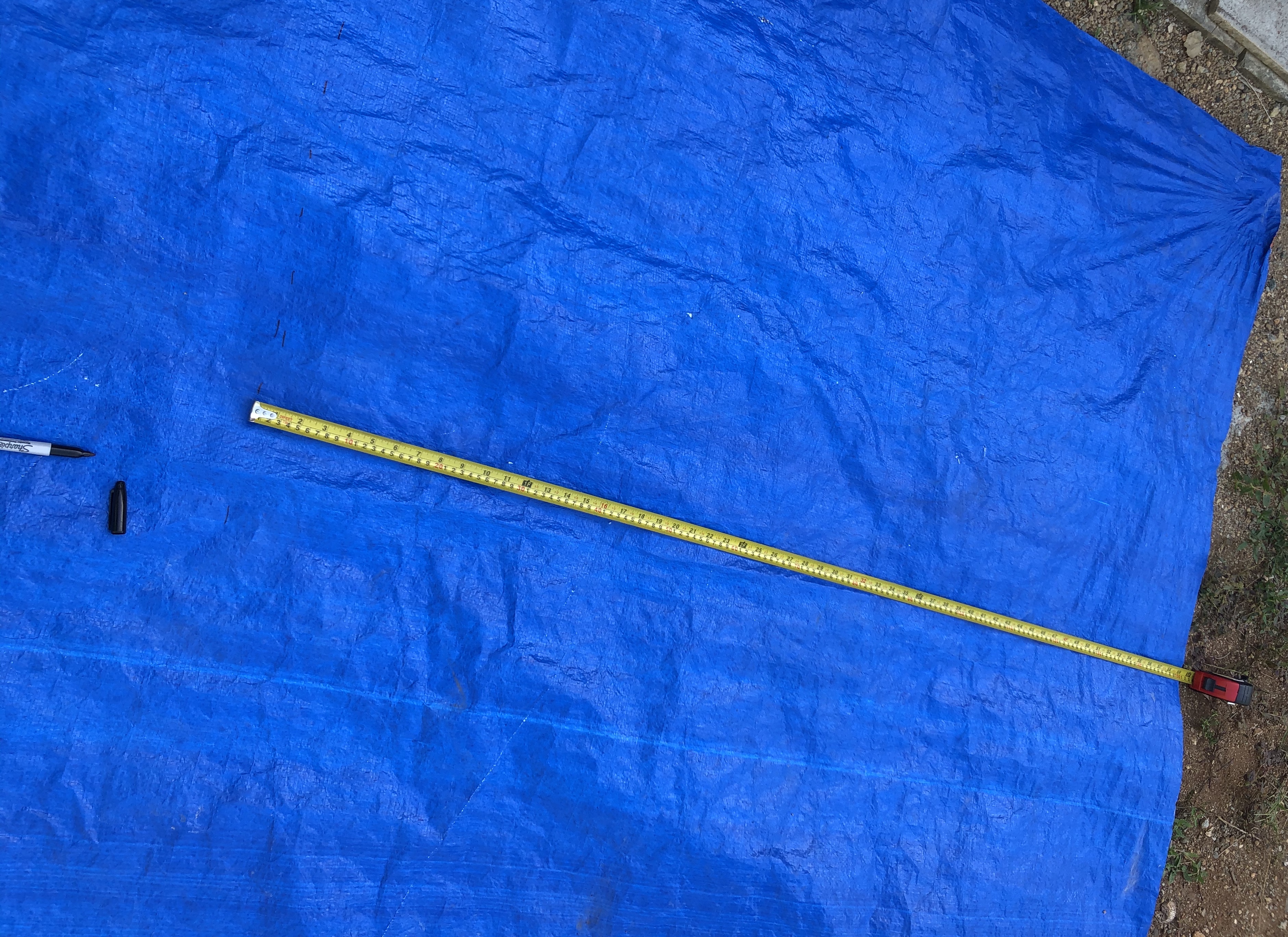
My medium
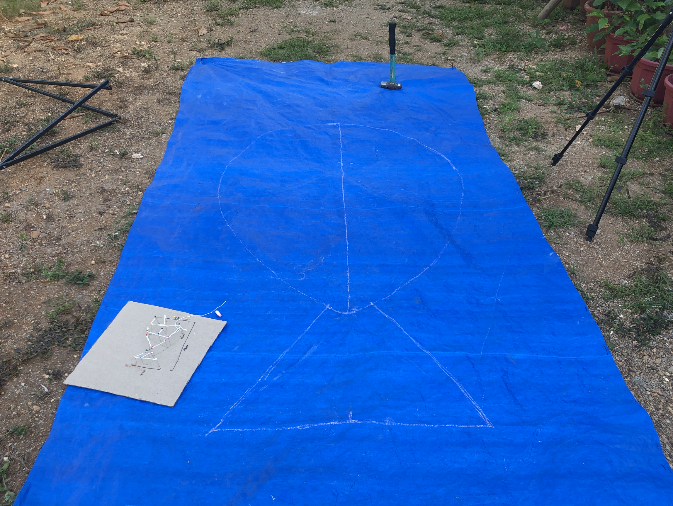
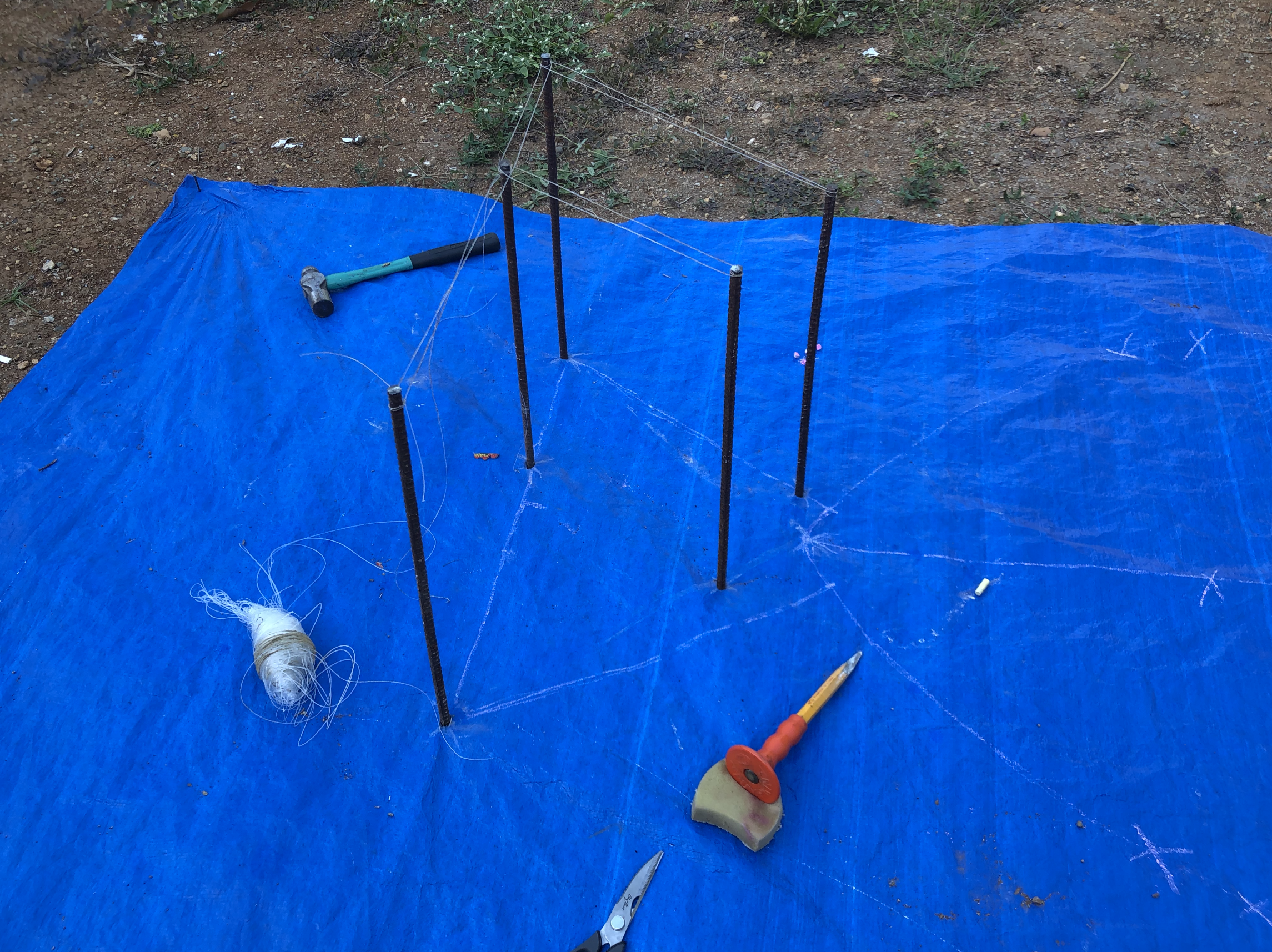
For this project, I am only using scrap: metal rods left around the property (to shape the typography and ultimately the fish), the fishing nets I retrieved from my dive (to put around the metal rods), a tarp left in a corner (to represent the ocean as I am unable to do this in the sea). My initial idea was to use plastic bottles instead of the metal rods, which would float on the ocean, & the bird (the drone) would then be relaxing on the water, before flying off.
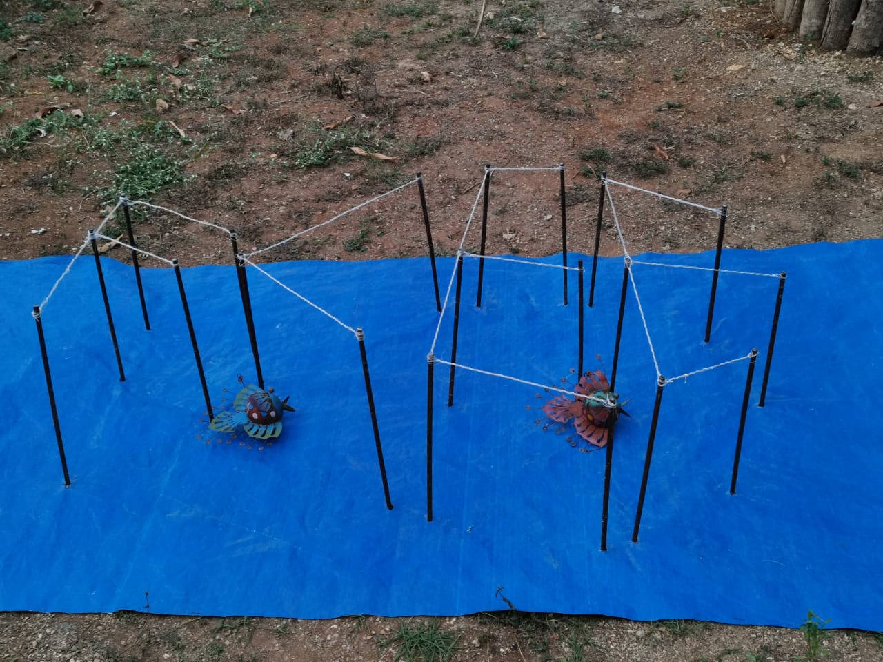
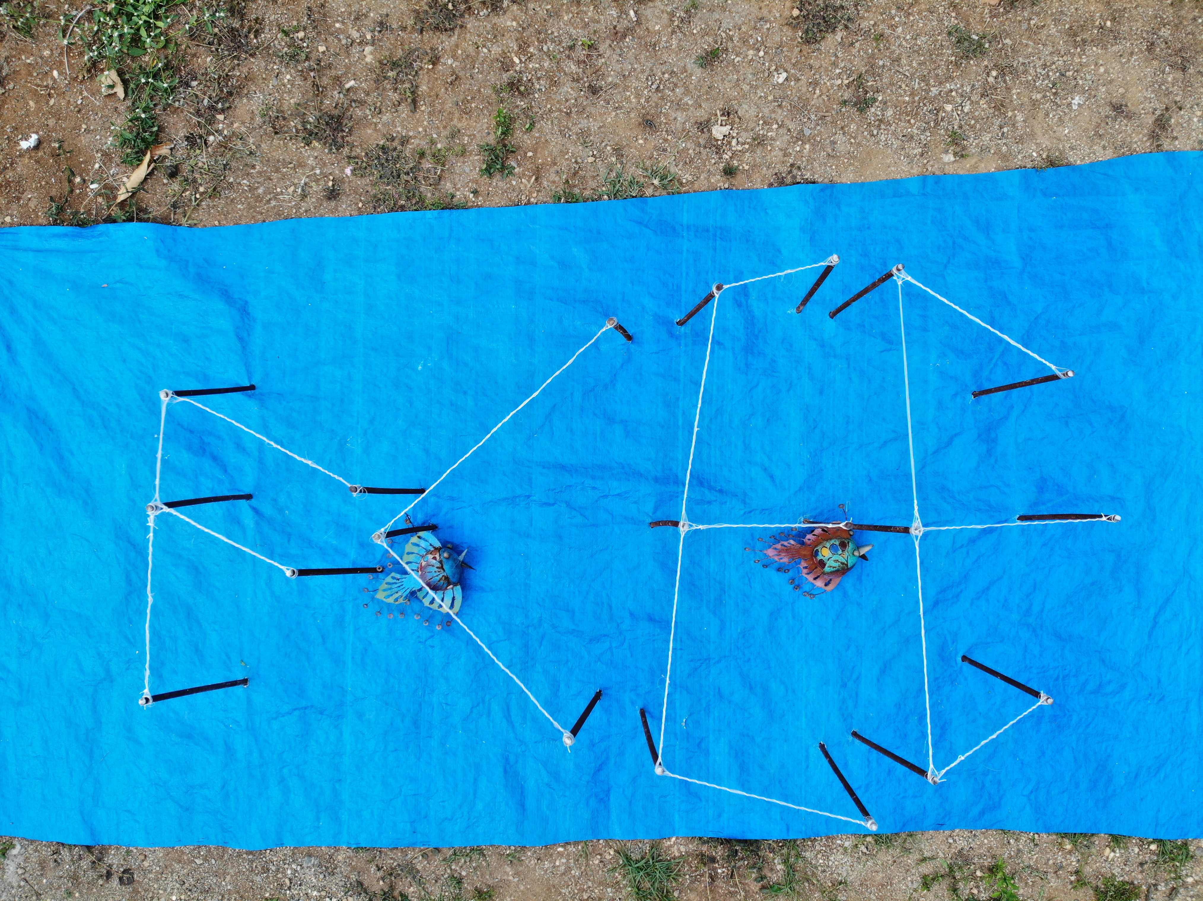
Model of my installation
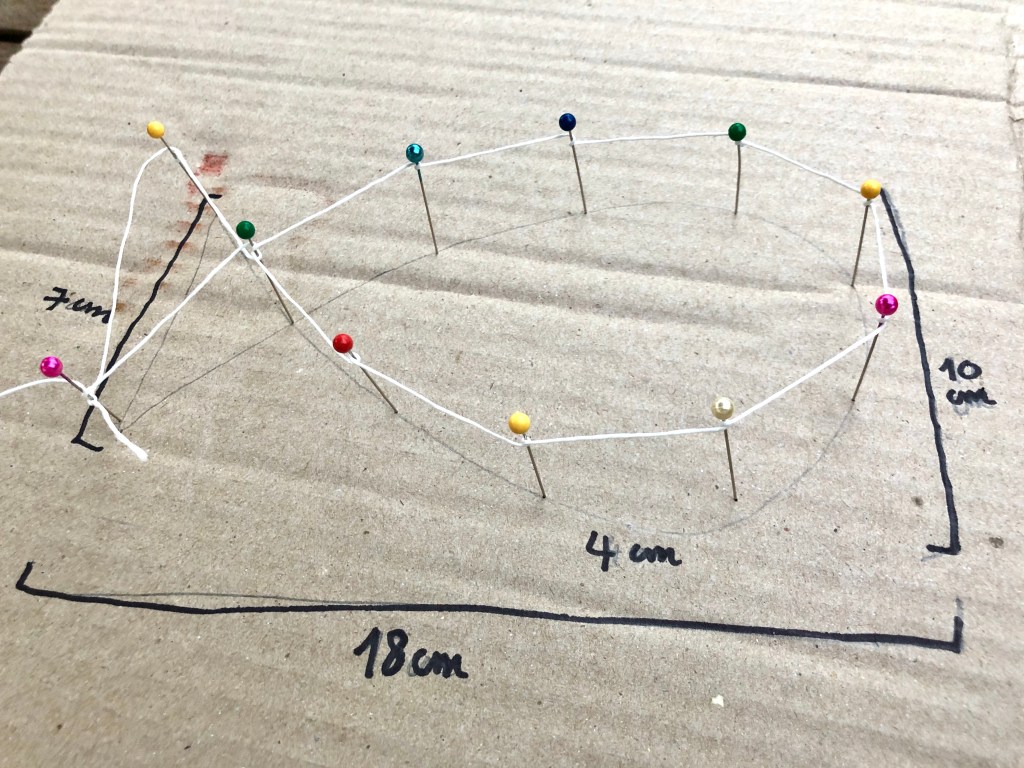
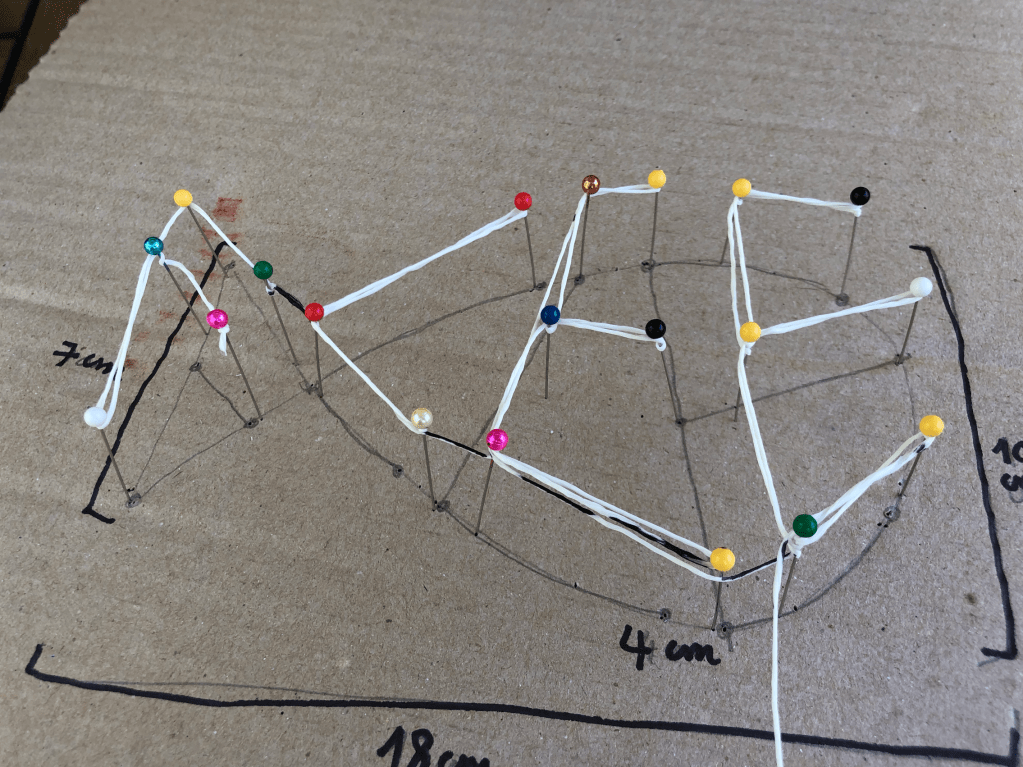
I made sure to do a model beforehand to know exactly if my idea was going to work, & to be able to calculate how much material I was going to need, as well as the scale I was going to make this at.
Images during the process
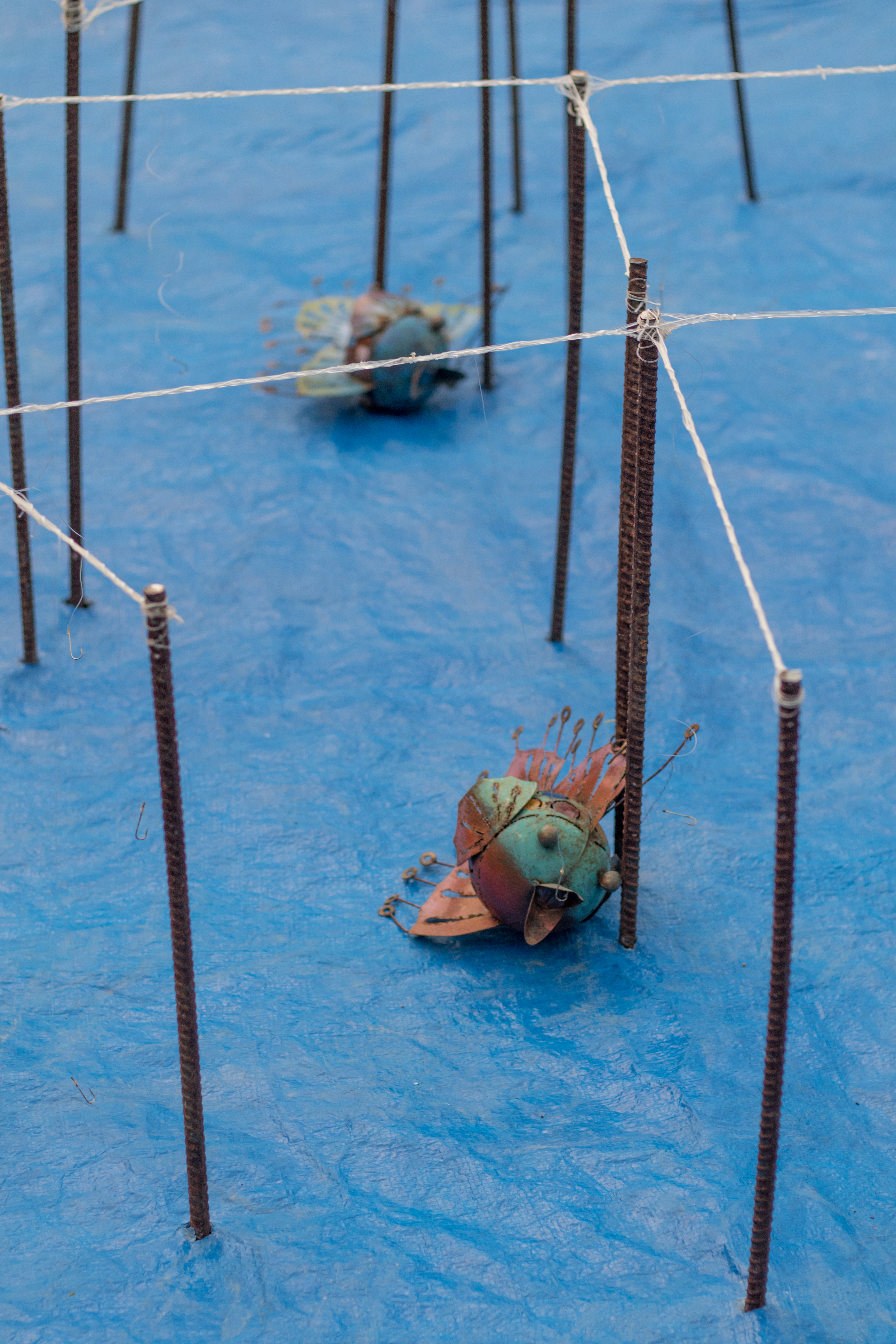
Now the long hours of drawing up the fish & letters, measuring metal rods, cutting them, making holes, hammering them in, & the task that took the longest time: untangling the fishing nets.

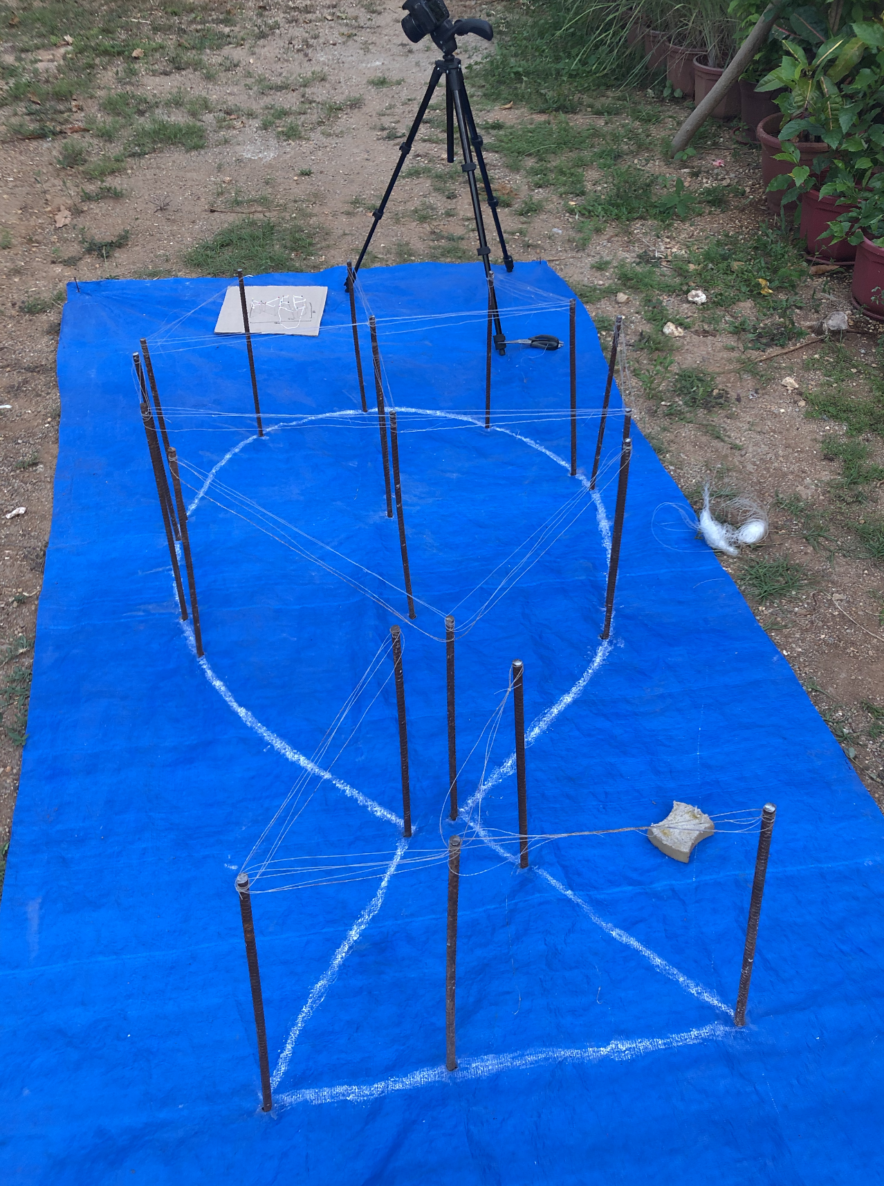
I was really unhappy with the above outcome. The letters were not readable @ all, & so the next day I decided to add even more fishing nets, & to tie them together with white string. The outcome was much more readable. Then, I decided to add some fish my parents had laying around in the garden, & put the hooks in their mouth to better represent the illegal fishing & then fish that died for no reason.