LECTURE REFLECTION & RESEARCH
This week’s lecture was a lot of learning for me. I was never drawn by typography & had never even thought about researching it. To be honest, I was no aware that it was this big within graphic design, or even the biggest element of it. For me, finding fonts that “have meaning” & “fit in” is just an overly tedious task that I absolutely despise doing (which is why in most cases I try to not apply any text in the artworks I produce). I also have never been friends w printers, they always seem to malfunction when I try to use them, so I usually keep away from them. Basically, long story shot, type is really not my cup of tea. This lecture was super interesting, though. Finding out how type was conceived & produced in the past was super captivating, & definitely had me become much more respectful of type as a whole. It is definitely something I disregarded & looked over my entire life.
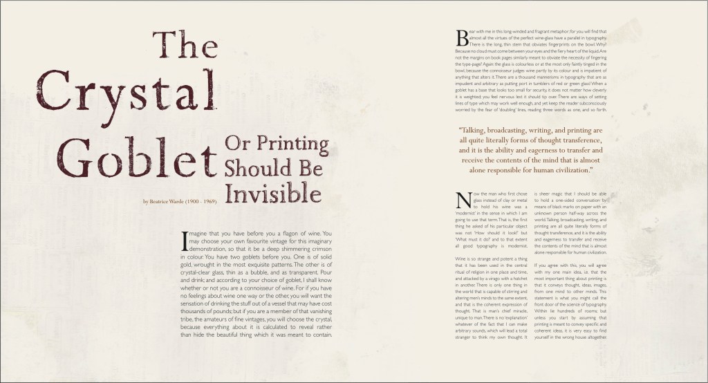
” The point is that the reader is interesting in seeing the meaning of the letters, not seeing the letters themselves.” – Beatrice Warde.
I really liked Beatrice Warde’s view on this, I agree with this statement. My mother being a huge book worm, she would rather be able to read the text properly than have the type be unreadable for the sake of “giving her emotions.” I actually find it very annoying when trying to read something & the type is overly exaggerated & hard to read, & I find it draws me away from the text, rather than captivates me. I do believe though that type is important when the goal of the designer is to intentionally convey something with type, but not when a piece of text just wants to be presented for information purposes.
Whilst researching, I became familiar with the term “concrete poetry,” which is something I’ve always really enjoyed reading/seeing. It basically defined by poetry which is communicated with visual representations.
Guillaume Apollinaire

I found the design on this poem very captivating & meaningful. The simplicity of just giving life to what is written is not the easiest way of reading it, but definitely gives the poem a little bit more meaning. This definitely sparked my research, & had me find a few more examples of design with text, which I’m very keen on creating my own.
Luis Camnitzer
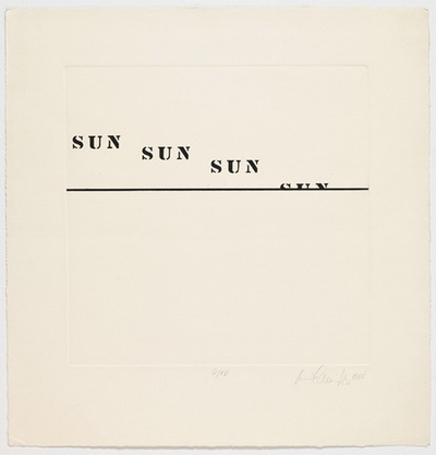
Luis Camnitzer is a German born Uruguayan artist/writer, & primarily works in printmaking, sculpture & installations (Luis Camnitzer, 2018). I immediately fell in love with this very minimalistic piece of work, & the very simple concept of the sun falling behind the horizon line.
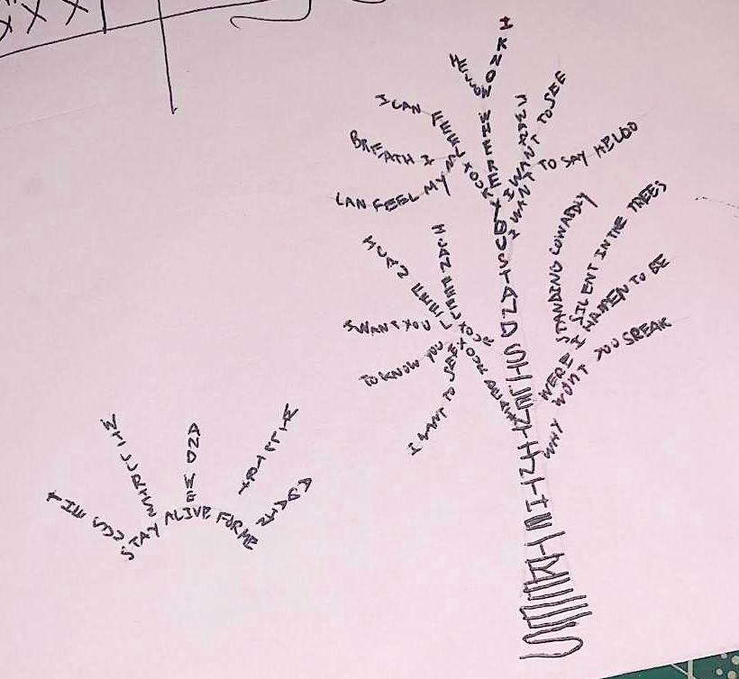
Daniel Wetmore

This piece of work stood out to me, mainly because of the major link between text & image. The type is smooth, gentle & soft, & plays with the imagery of flying away. this is definitely the style I want to go for with my work. I have actually thought about making concrete poetry like that, but never found a good idea, so hopefully coming up with something will not bring down a huge creative block.
REFERENCES
Alexander Gray. 2018. Luis Camnitzer. [online] Available at: <https://www.alexandergray.com/artists/luis-camnitzer> [Accessed 29 March 2020].
Apollinaire, G., 1918. Il Pleut.
Beatrice Warde, The Crystal Goblet: Sixteen Essays on Typography, Sylvan Press, London, 1955.
Camnitzer, L., 1968. Sunset.
Drummond de Andrade, C., 1940. Sentimento Do Mundo.
Wetmore, D., 2009. Surrounding Myself.
WORKSHOP CHALLENGE
Idea #1
Not being a fan of reading, when seeing the brief saying to use work from a poet or an author, I immediately blanked out, & started researching very popular & overused quotes from famous poems & books. When I drifted away from that, I sort of started looking at work by famous french poet (with the help of my mother), such as Jacques Prévert and Charles Baudelaire, due to their use of imagery within their writing.
Unfortunately, nothing stood out to me, & so I drifted towards Carlos Drummond De Andrade’s work, a Brazilian poet (with the help of my girlfriend, also I understand Portuguese when I read it). More specifically, I was orientated towards one of his most famous books titled “Sentimento Do Mundo” published in 1940. It contains a series of poems which he had written from 1935 to 1940, during the time of which people were still recovering from World War I. One poem, which is the opening one, stood out to me:
Tenho apenas duas mãos (I merely have two hands)
E o sentimento do mundo, (and the feeling of the world)
Mas estou cheio de escravos, (but I am full of slaves)
E minhas lembranças escorrem (and my memories slide away)
E o corpo transige (& the body transgresses)
Na confluência do amor. (in the confluence of love)
(Drummond de Andrade, 1940)
Here are 2 rough sketches of ideas:


I was not satisfied with these ideas as well as the text used. This is mainly because I feel absolutely no connection to the text, & I felt like using this was more about taking someone else’s interests & using them as an easy way to get this project done. I decided to focus on something that really means something to me, & that was none other than music lyrics.
Idea #2 and #3
I went through a few of my favorite artists’ songs to try & find something that really inspired me. Of course, my choice would have to be around the band I’ve listened to the most while growing up during my teenage years. In 2012, I found out about the band “twenty one pilots.” I was going through a lot mentally, my mental health was very bad, I went to a psychologist & took prescribed medicine, but nothing would help me get out of my darkest hole more than this band ever did. Their self titled album was released in 2009, & in no time became my absolute favorite album due to how different their music was, & how well the lyrics were structured. I was so intrigued by the album @ first, mainly because it followed absolutely no structure, no rules. It was so different from all the other music I had heard. & the lyrics, really hit home, & for the first time in my life, made me feel like I was understood, & not alone.
I attempted 2 rough sketches. On the left, “Truce” by Tyler Joseph (twenty one pilots):
“Now the night is coming to an end
The sun will rise and we will try againStay alive, stay alive for me
You will die, but now your life is free
Take pride in what is sure to dieI will fear the night again
Truce by Tyler Joseph
I hope I’m not my only friend.”
On the right, “Trees” by Tyler Joseph (also twenty one pilots):
“I know
Trees by Tyler Joseph
Where you stand
Silent
In the trees
And that’s
Where I am
Silent
In the treesWhy won’t you speak?
Where I happen to be
Silent
In the trees
Standing cowardlyI can feel your breath
I can feel my death
I want to know you
I want to see
I want to say
Hello”
Idea #4
I was not very happy with working with concrete poetry. To me it seemed like an easy way to visualise a poem rather than thinking about type & playing around with it. So I decided to look for another song which I could play around with. I wanted to really play around with the letter spacing & the lead to convey my text.
I chose the lyrics (so poem) to the song Air Catcher, also written by Tyler Joseph, & decided to focus on the 1st verse only due to the length of the song. The song song reads:
I don’t fall slow like I used to
Air Catcher, by Tyler Joseph
I fall straight down
You’ve stolen my air catcher
That kept me safe and sound
My parachute’s what got me
Safely to ground
But now the cord’s not working
And I see you staring me down
The full lyrics can be read at https://genius.com/Twenty-one-pilots-air-catcher-lyrics
I thought this verse had a lot of potential for me to really be able to play around & experiment with letter spacing & lead.
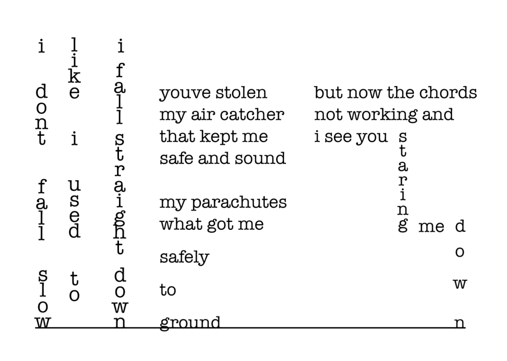
I decided to go for a regular typewriter type, because of it’s simplicity. I felt like the letters were not too linear yet kept a serious element. I kept the font regular because having it bolder gave a tragic emphasis look on the overall text, & having it lighter made it feel too weak & vulnerable.
Idea #5
Not being happy with this outcome & not being comfortable working with type & font digitally, I decided to re make this by hand.
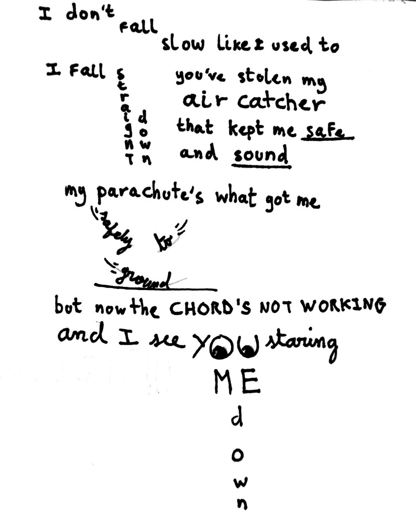
This was my 1st attempt. From analysing what I had just made, I noticed a few things: for one, I was going wild with diverse types (serif, sans serif & script) which made the overall design very messy & inconsistent. For two, I did not play around with fonts @ all, & my visuals were very amateur/childish looking.
After developing it further, it gave this:
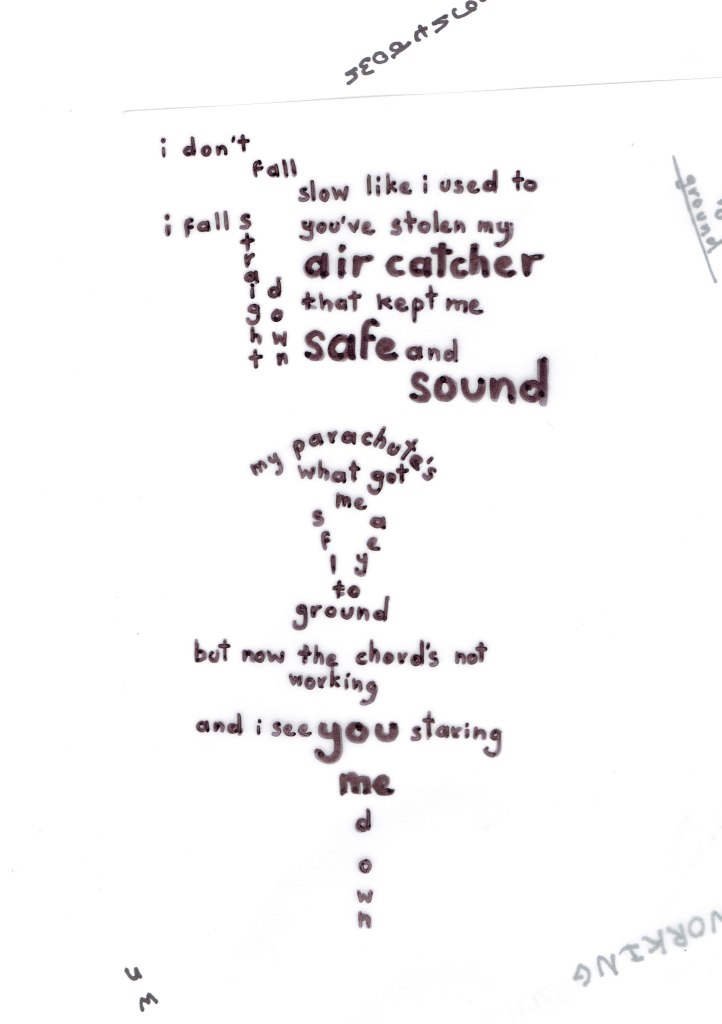
I then spent a few hours digitalising it while still keeping my original type. I made sure the lines were all linear & most importantly that the placement of each of them had sense: for instance, every single line can be analysed with a ruler & you will see that it was placed in function of another line. I really wanted to focus on this to convey what was mentioned earlier, which is that the songs Tyler Joseph used to write showed no industry standard rules, but still was very coherent & calculated.
FINAL OUTCOME & REFLECTION
Draw it, typeset it, build it
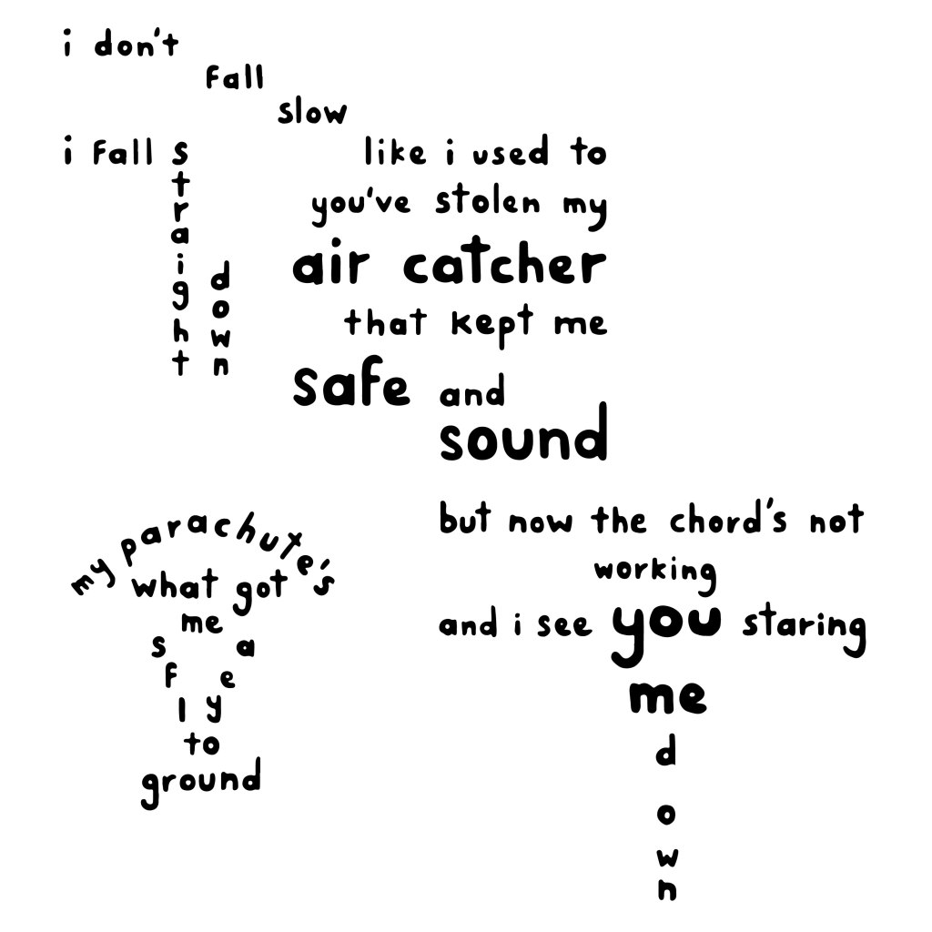
How does leading, positioning, stresses on particular words and detailing affect the power of the piece?
I wanted the design to have space to breathe, & so made sure the leading & letter spacing was reasonably spread. Using serif also made the work look more clean & clear. I included a bolder font & bigger size on the words “air catcher,” “safe,” sound,” “me,” & “you” to reference the empathy Tyler puts on those words while singing the lyrics.
How is meaning affected by interpretation in a tangible way?
Meaning is affected by the positioning of the lines/words. By using a ruler or just having a good eye, we can see that each is placed within calculations of another. I did this because I wanted to reflect the song structure of Tyler Joseph in my work. He used to structure songs in a way that doesn’t follow industry standards (not making his lyrics rhyme, starting a song off with a chorus, not having a chorus, etc). This is done by making the outcome look almost messy, while it is in fact coherent & balanced. I really wanted to incorporate the element of concrete poetry without making it too obvious & try-hard, & so decided to incorporate the parachute visual subtly.
What is the relationship of the page?
The page stands as the canvas of my design, I decided to make it square to follow the calculated process of the design. It also kept the design in a specific shape & stopped it from leaking in random directions (which was what happened with Sketch #6 above). I wanted to keep the page black & white for the reader to not get distracted by colours & other shapes.
